
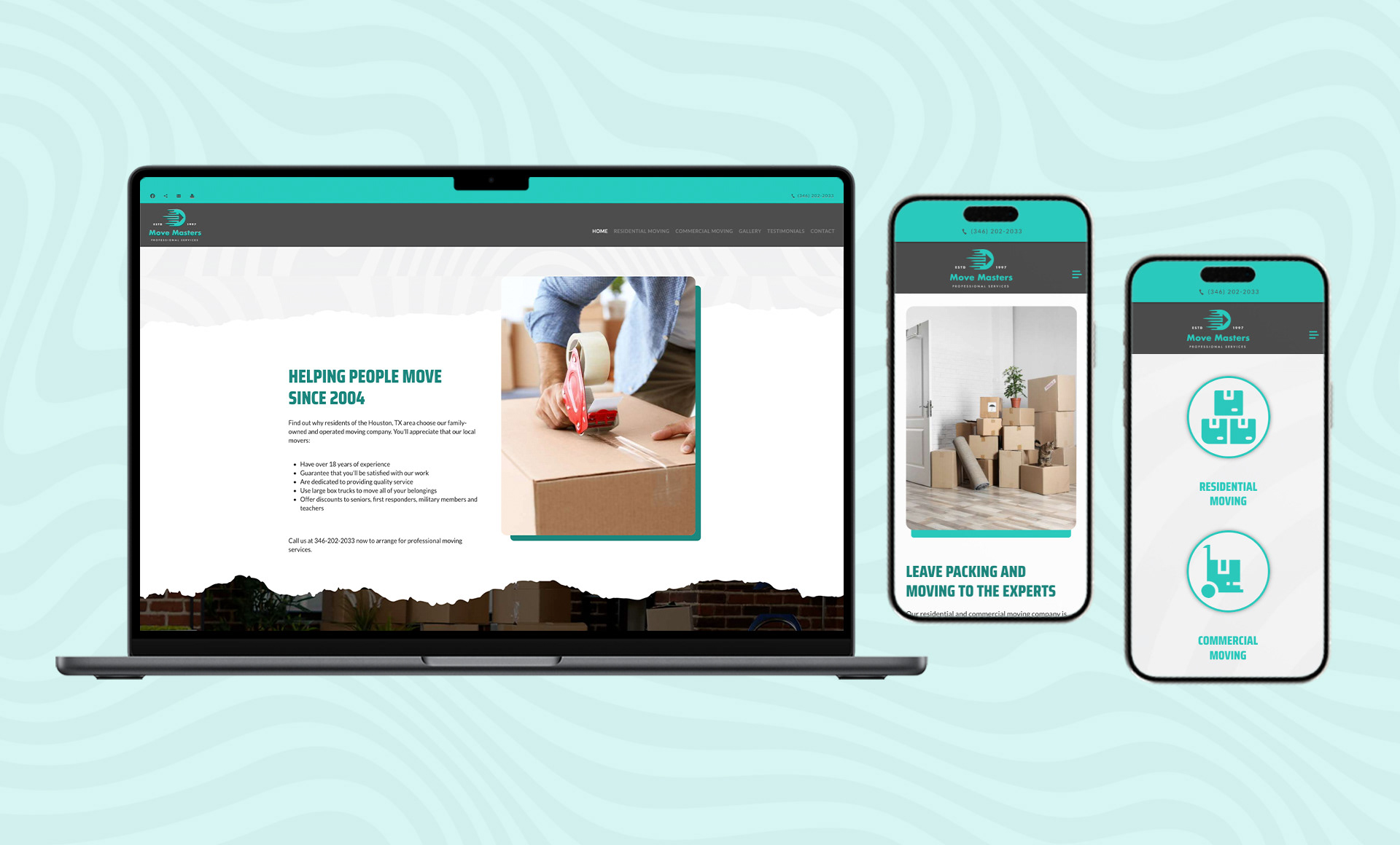
Move Masters is a moving company headquartered in Houston that has residential and commercial customers. They have excellent branding and hands-on strategy. They had a unique look on their previous site but were not mobile-enabled and had usability concerns. My objective was to maintain their strong visual brand but entirely redesign the experience for users with mobile screens.
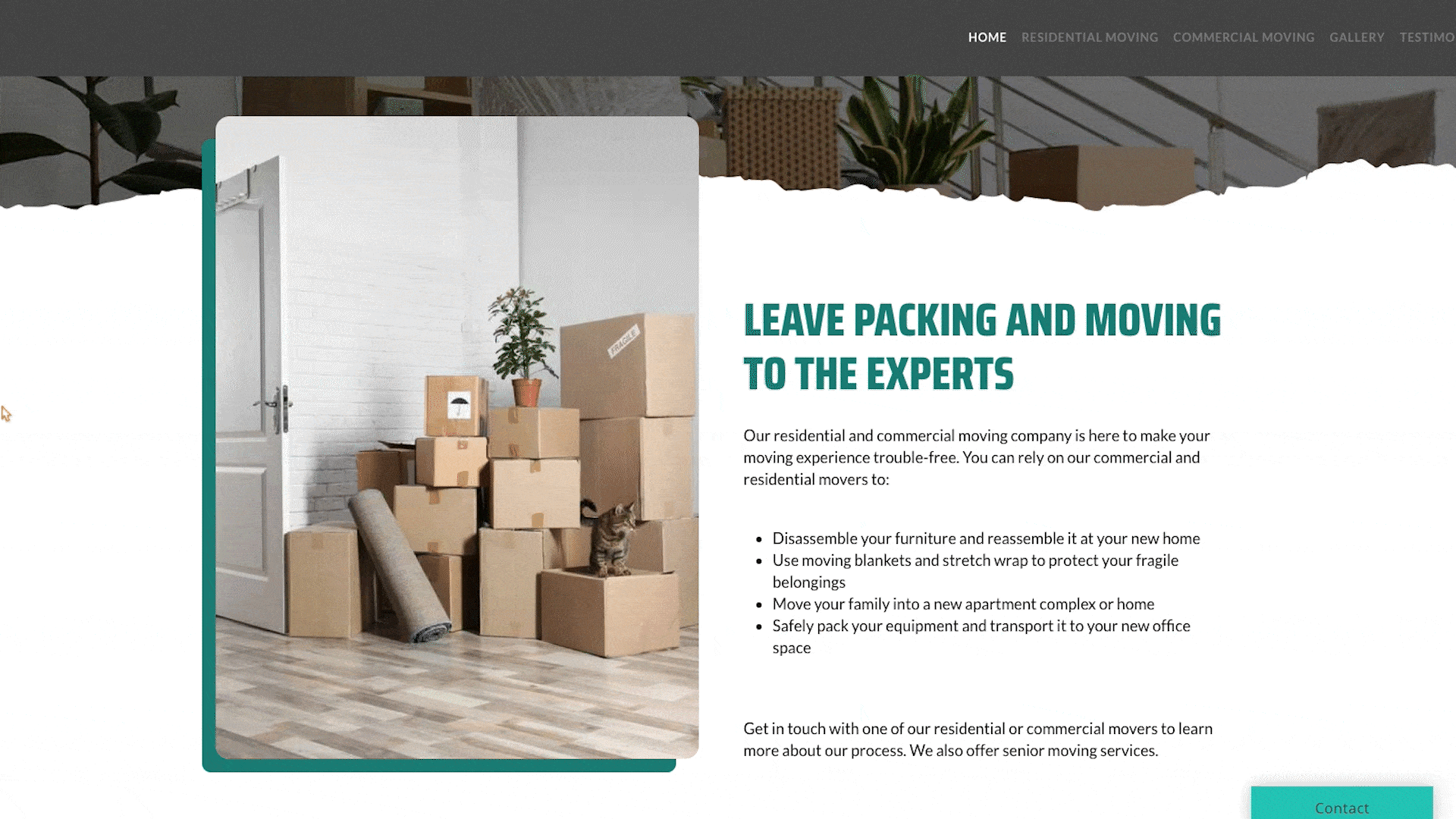
I saw the visual possibility in their initial design and sketched out primary features including large texturing, graphic color blocks, and kinetic forms in order to create a new adaptive design system. The system conveys energy, momentum, and power, key elements of the traveling company and of the brand. The result is a new fresh visual identity that is both innovative and understandable.
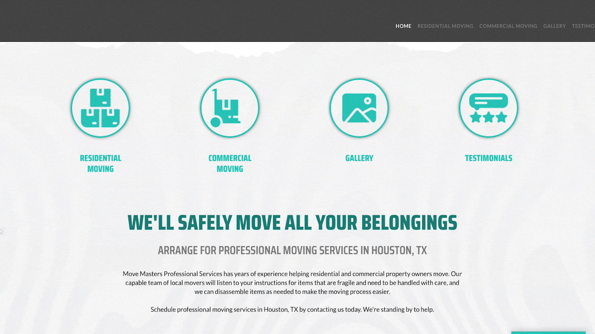
To interact more with the users, I employed layering microinteractions on the website. Thoughtful hover states were incorporated on icon cards, responding with smooth color transition and subtle rotations for a natural feeling of movement. Border animations on bespoke image holders enhance depth to the feeling of activity and energy.
The visual language finds a balance between grittiness and friendliness. The rounded corners and modular grid introduce the factor of contemporariness and coziness. Textural details like torn edges and rough textures evoke the effort of the move. Full-bleed photography and interactive layouts stir up emotional connections, understanding the stress of moving and providing the users with empathy and professionalism.
One of the unique aspects is the wavy, layered background design pattern. It's a two-use element-aesthetic and structural. It rhythmically interrupts content and takes users through the site in a human, friendly way. It provides personality and warmth to a marketplace that is all too often generic or cold.
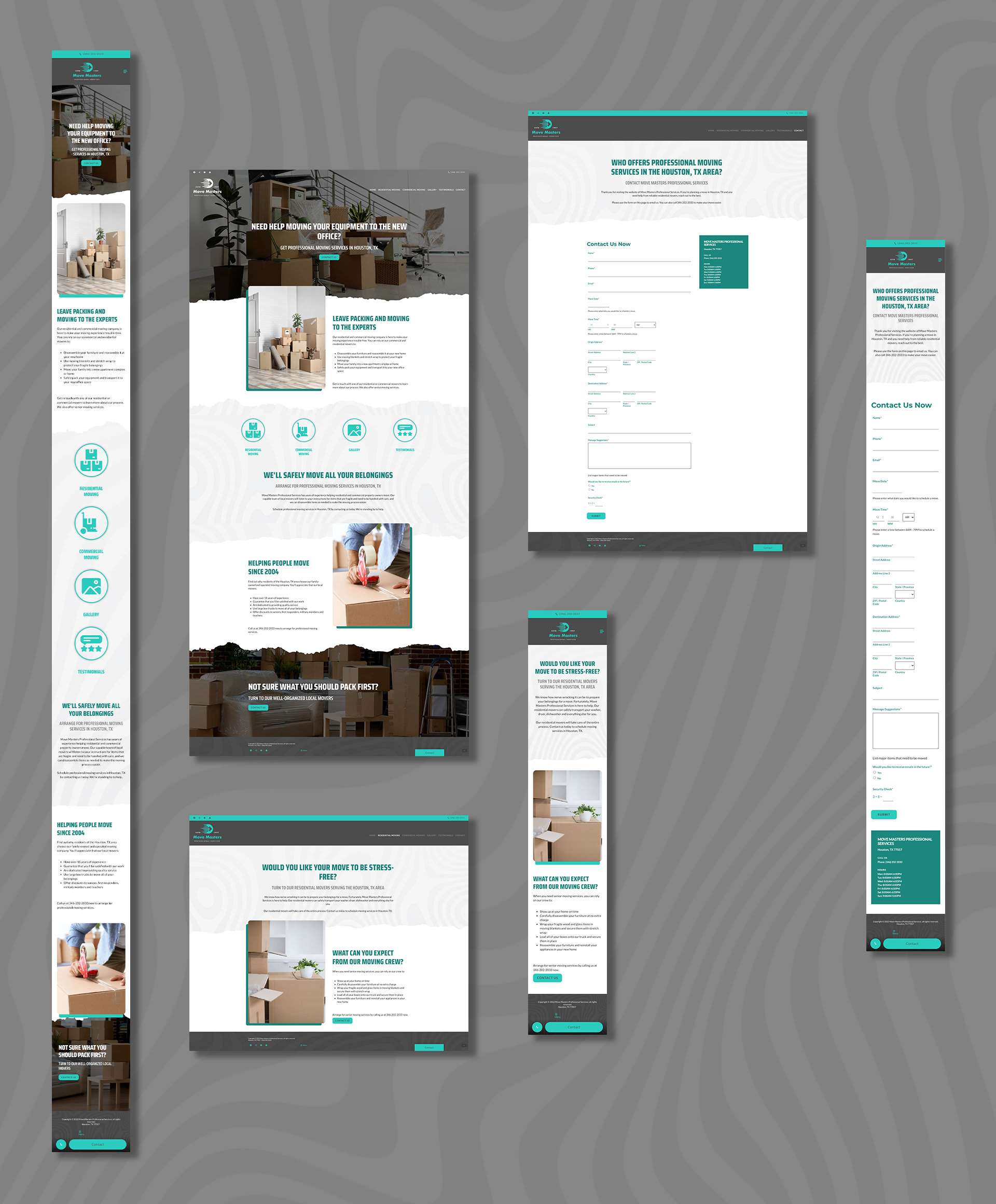
Responsive design was paramount throughout the project duration. All functionality, from image resizing to typography to layout behavior, was implemented with a mobile-first approach to give maximum performance across all screen resolutions. Typography spacing and order were for readability while avoiding visual impact on various devices.
Each page was designed carefully to meet the Move Masters brand without sacrificing on a clean, consistent experience. The redesign improves functionality and interaction. It also positions the company solidly in the sphere of assertive, professional, and personality-based.